The color wheel
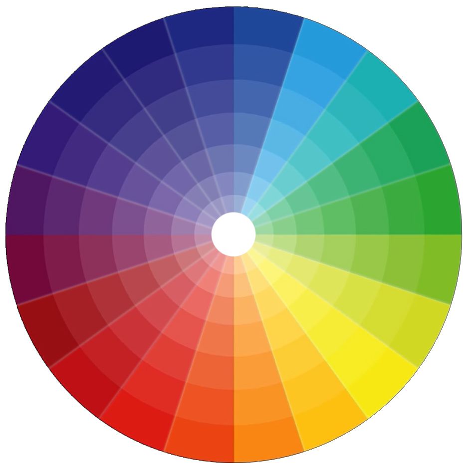
The color wheel is a way of organizing colors in a circle, showing the relationships between primary, secondary and tertiary colors. It can be used as a source of inspiration for generating color schemes with different looks and feels.
Color Harmonies
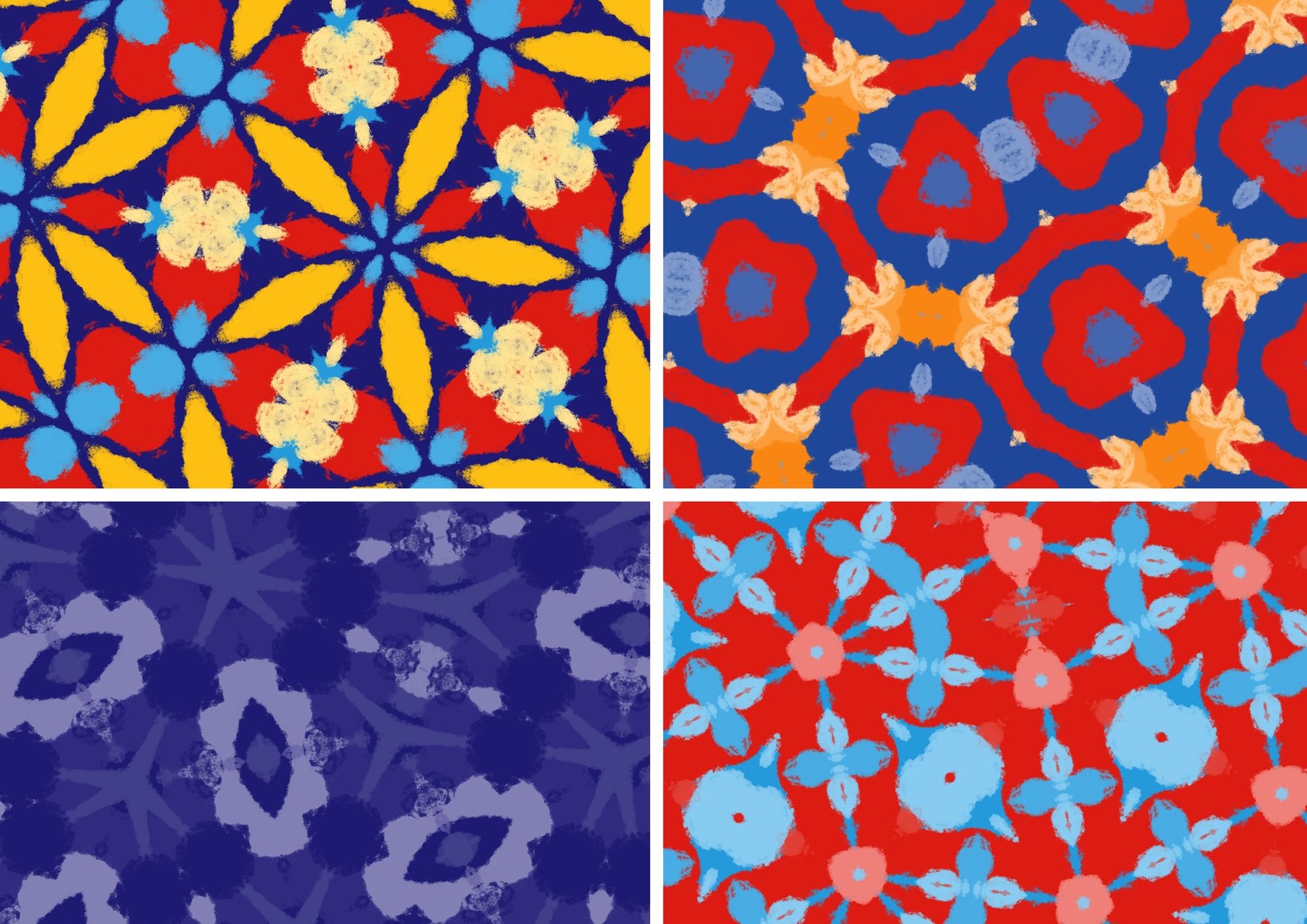
Here are some color combinations you can create using the color wheel. Each type of color harmony will give a different effect, ranging from softer types of images to high contrast ones. All of these can be effective and useful for certain scenarios. I recommend you play around with all of these and see what it does to your image. You could search for images which have these harmonies or create them yourself in graphics software like Photoshop.
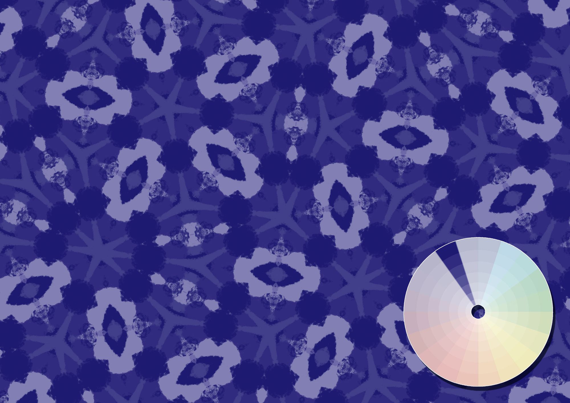
Color Harmony #1 - Monochromatic
Different shades within a single hue. This makes a very soft and balanced image. ↓
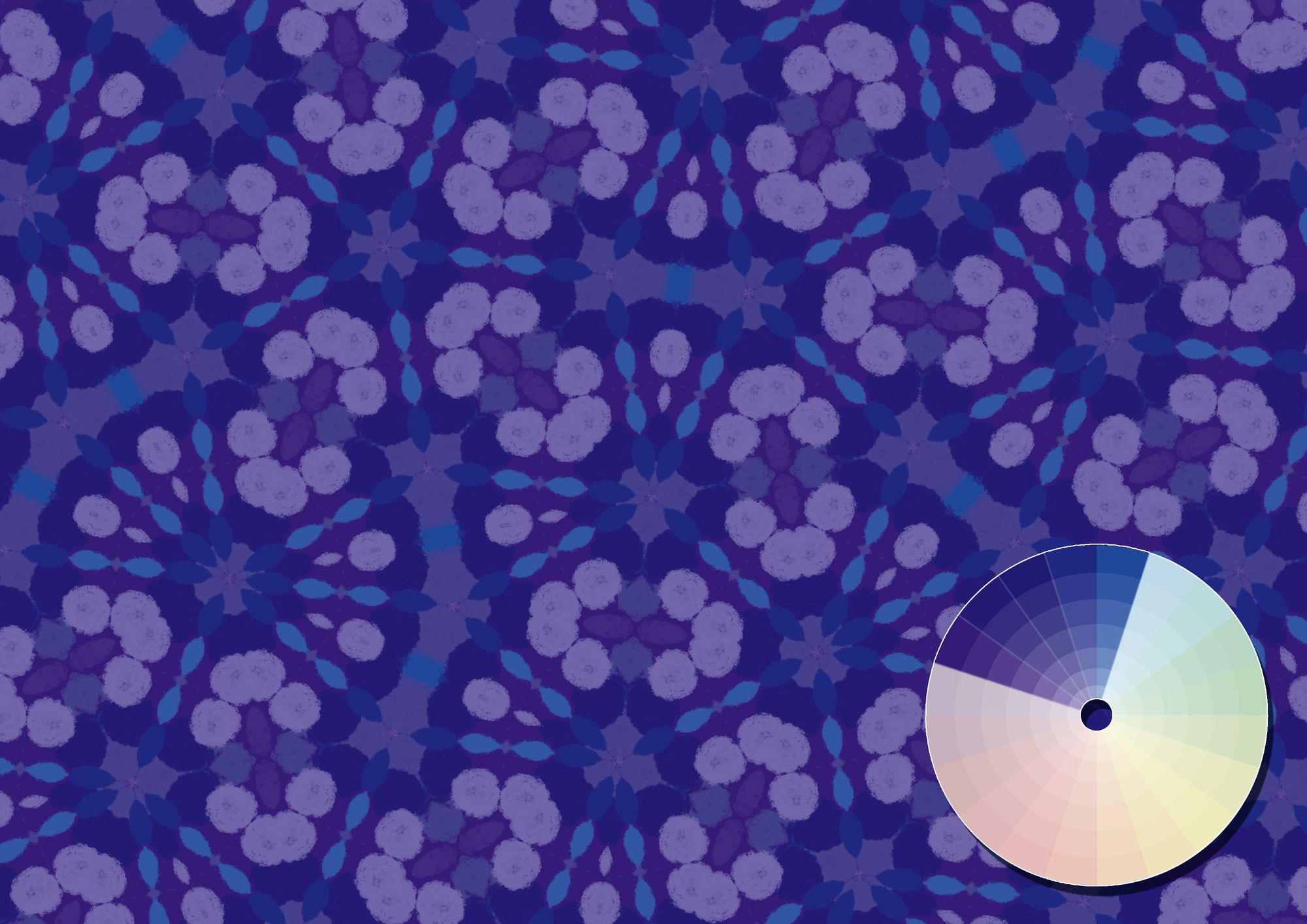
Color Harmony #2 - Analogous
Using a range of colors close to each other. They tend to be soothing to the eye, yet not as flat as monochromatic harmonies we saw before. ↓
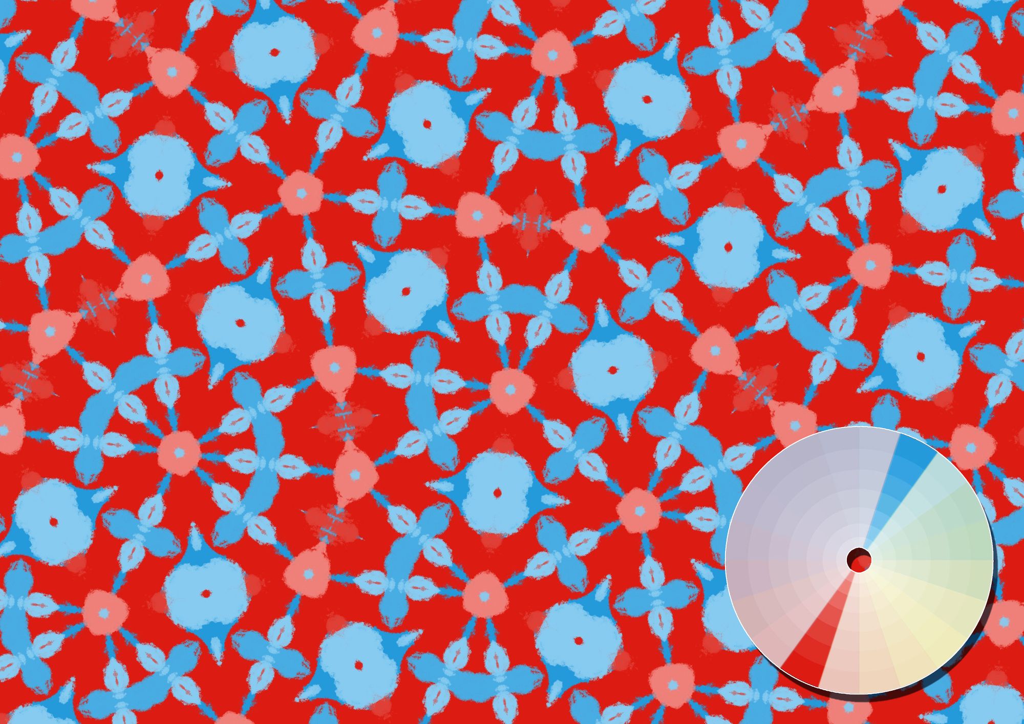
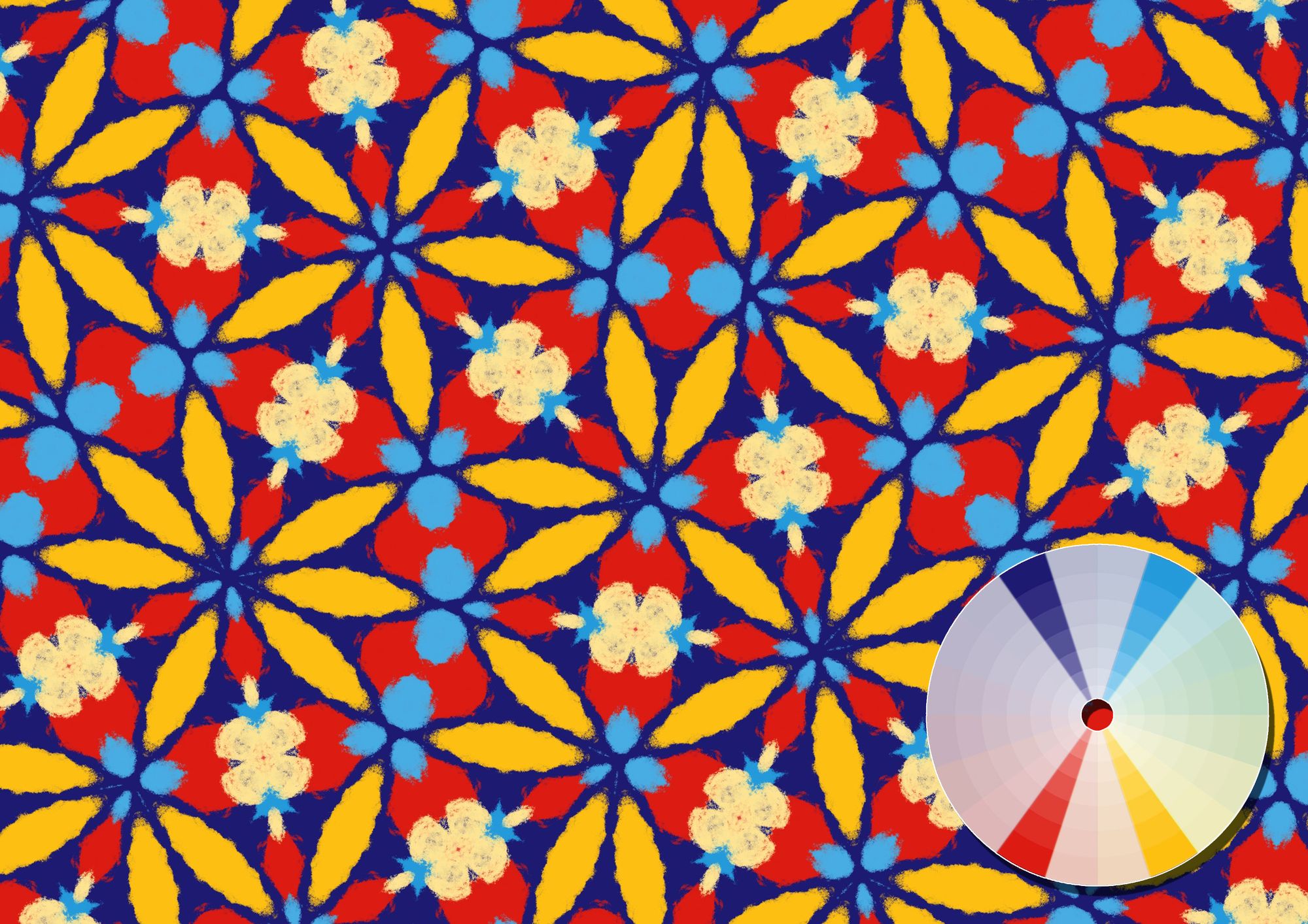
Color Harmony #3 - Complementary
Give your images maximum contrast by using 2 colors opposite each other. This is perfect for making a very punchy image. Because of the high contrast, it’s not easy to successfully implement this color scheme, but it can be worth it! ↓
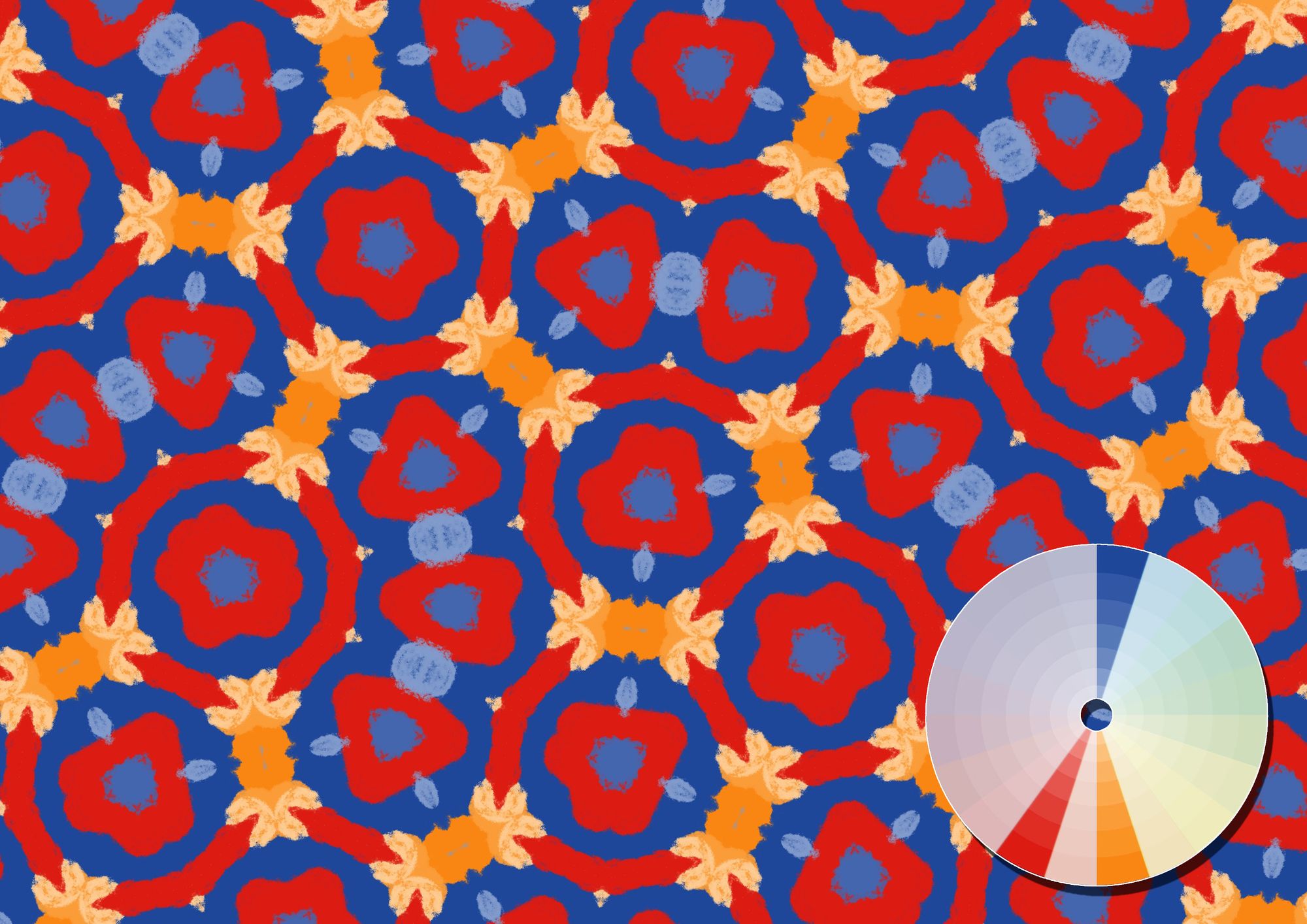
Color Harmony #4 - Split Complementary
Similar to complementary harmony, but with one of the colors being split into its neighbouring colors. This creates less tension and give a slightly softer but still very contrasting image. ↓
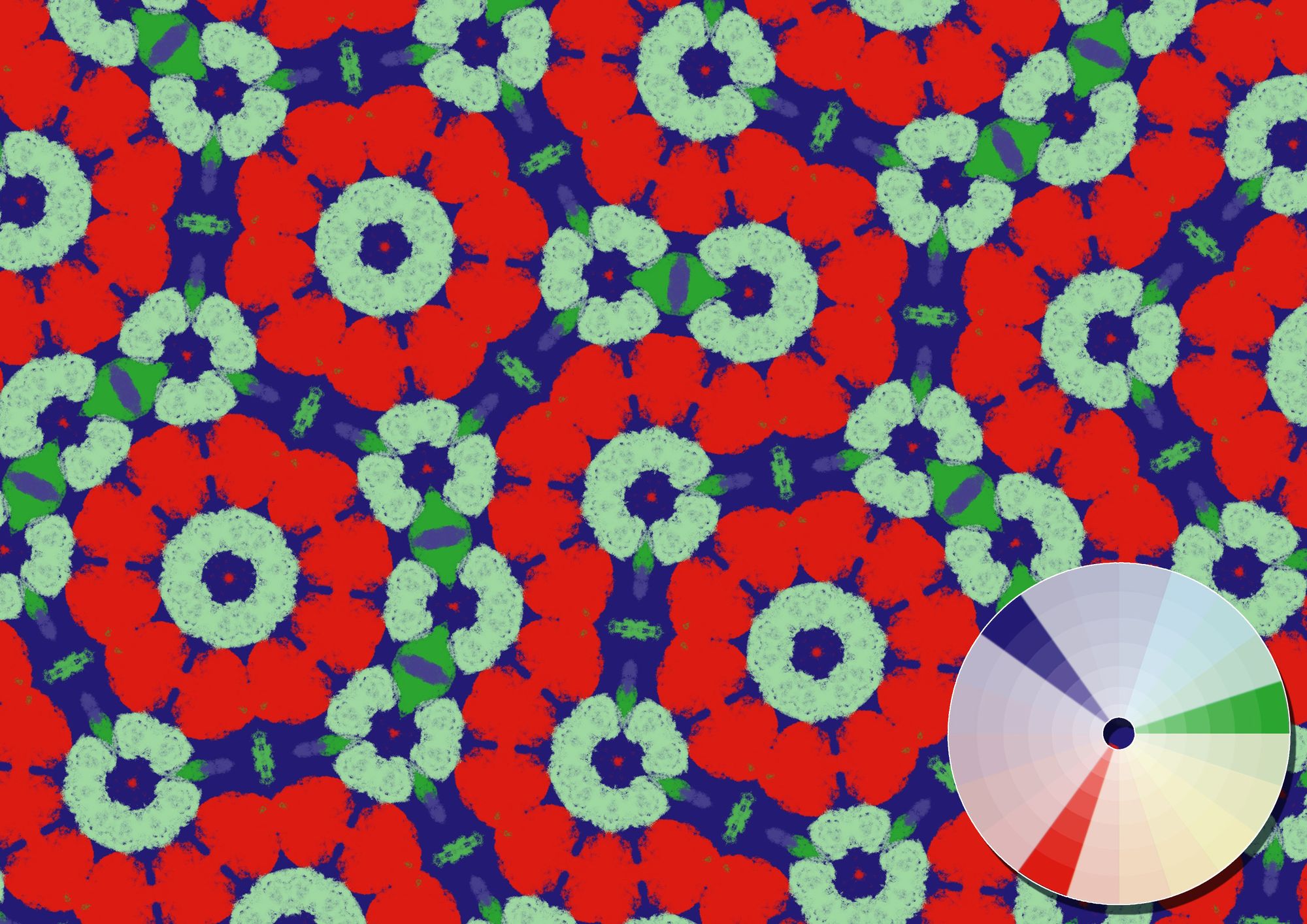
Color Harmony #5 - Triadic
Three colors, all with a similar distance from each other. It will grab attention without being too harsh and contrasty. ↓
Color Harmony #6 - Square
Four colors, all with a similar distance from each other. This color harmony is less common and also a bit more difficult to use, but can create beautiful, high contrast images. ↓
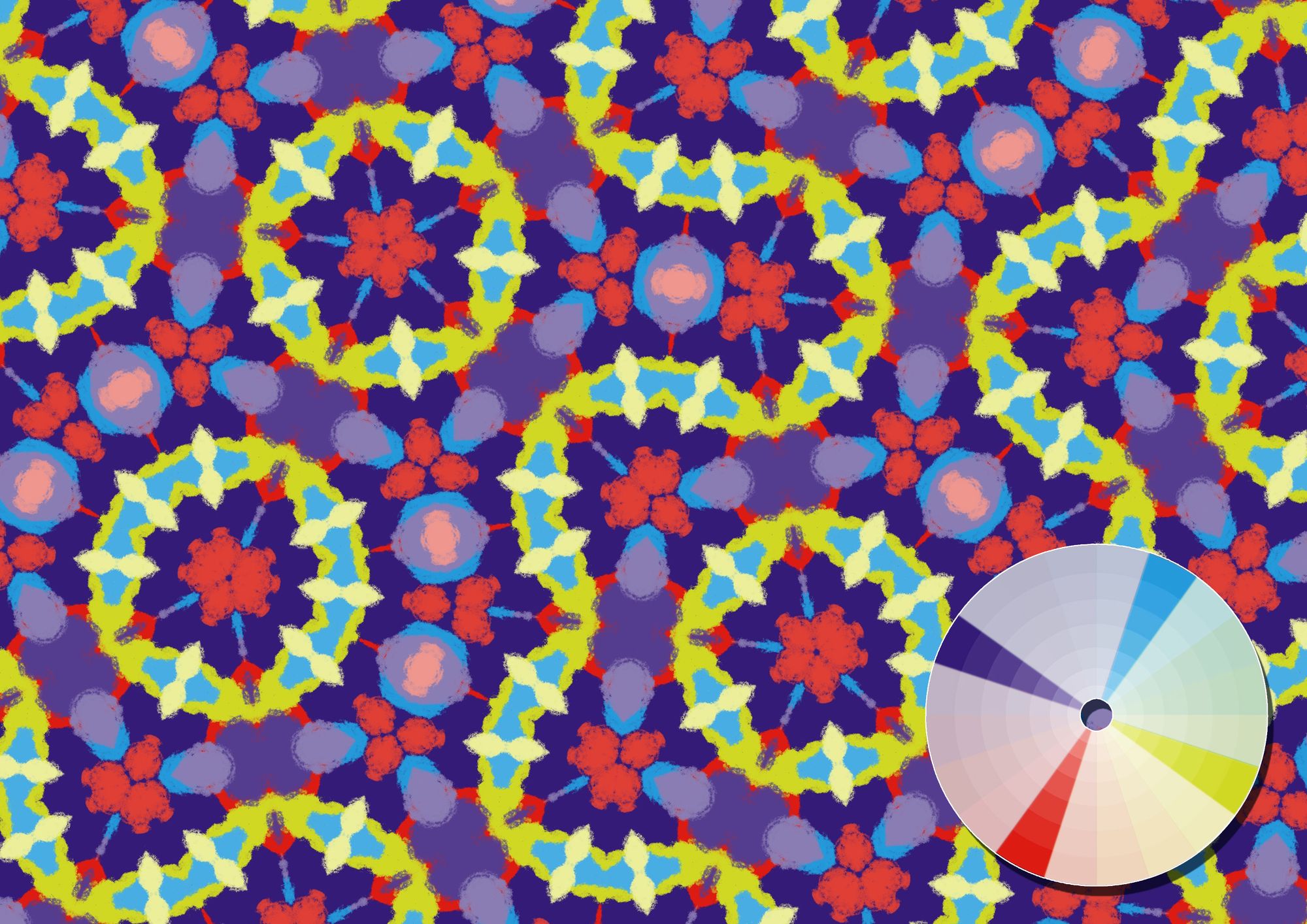
Color Harmony #7 - Tetradic
Similar to square harmony, but bringing the colors slightly closer to eachother. This color scheme will provide a lot of variety. ↓
Some general tips
Besides colors, keep in mind that brightness and saturation could also bring different effects to your images. Also textures and shapes will have an impact on the look and feel. Experiment with choosing one or two main colors and give them more saturation or brightness compared to the other colors.
Excited to put your new color knowledge into practice, but not quite sure how to get started? Check out my recent post about making your own source images.
Happy patterning!
Make beautiful geometric patterns with Repper
Instant results · 14 days free access · No strings attached
Create your own pattern