A great tool doesn't just help you get the job done; it does so in a quick and enjoyable way. We care deeply about the way Repper looks and feels and saw some room for improvement. Here's how we changed the layout and how it opens up new ways of using the app.
A simpler structure
Below is the old interface as you know it. Pretty well-organized, but there is a lot going on: two layers of tabbars and fair few controls bunched together under the preview.
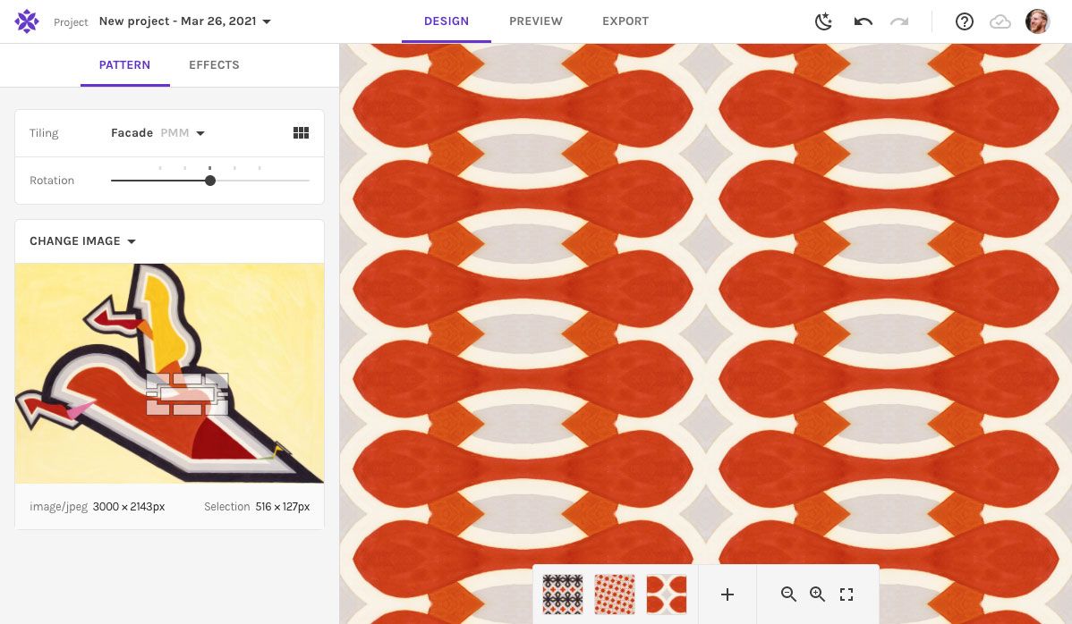
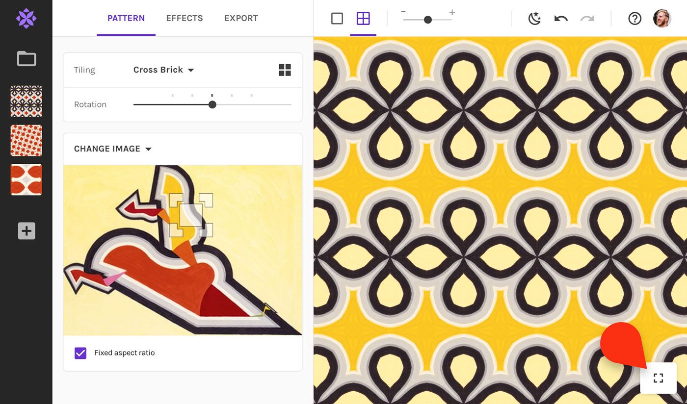
Next is the new UI, with a simple structure:
- Left column: Your project and snapshots
- Middle column: Everything to edit and export your pattern
- Right column: Pattern preview and options
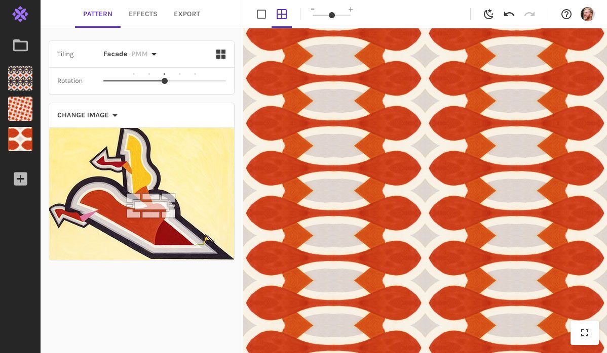
So what exactly changed? Let's have a look at the changes one by one.
A proper home for your snapshots
The snapshots were always a bit hidden, sitting at the bottom with the big pattern preview hovering over them. Now they live on the side, with space to breath. By arranging them vertically, they're easier to scroll through if you use a mouse wheel.
By the way, the project switcher sits right above the snapshots. Most users didn't find the project name useful enough to have visible all the time, so we've dropped it to save some precious space.
No more modes
You might be surprised to see the pattern/preview/export modes are gone. Have we removed functionality for the sake of simplicity? Definitely not, in fact the opposite!
We've moved the export settings to the left sidebar. Whatever export setting you choose is how your pattern will be shown in preview. By default, the surface fits the entire preview area. Set it to your own custom size, and it will stay that way—also when switching back to the other tabs, so you see exactly what you'll be exporting!
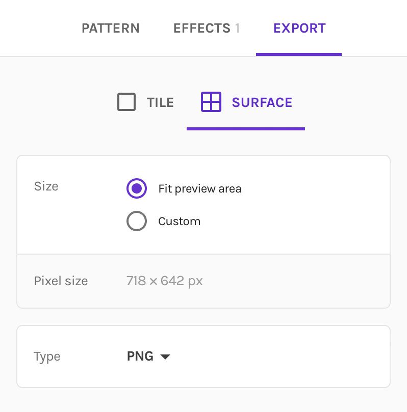
Being able to edit while seeing the actual export size is especially handy if you enjoy working with the Metamorphosis effect. Because it creates a pattern that changes across the surface, it used to be hard to tweak the effect without being able to see the final surface...
...not anymore! 👇
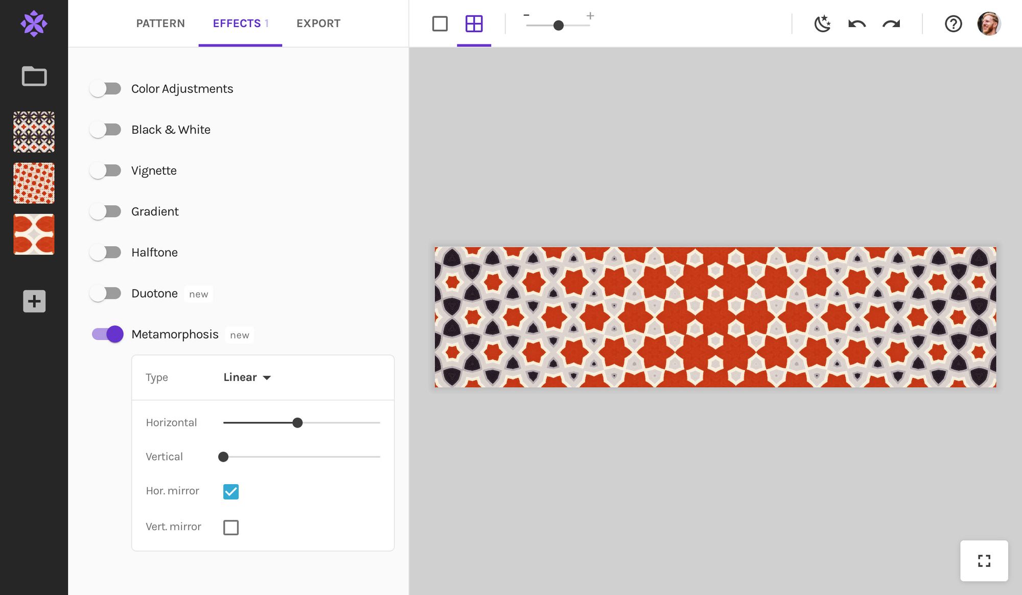
You don't have to go into the Export tab to change format. Above the preview there is a little tabbar to switch between Tile (left) and Surface (right).

And here is a little trick: if you click the Surface button (right) while it's selected, it will switch the surface fit-to-preview and custom size. Nifty, right?
More precise zooming
Instead of the zoom in/out buttons, we've now added a zoom slider. This gives you much finer control over the zoom level.
You will meet the zoom buttons again soon, but with a new purpose... stay tuned!

A new preview mode
Are you worried the preview mode is gone? It's not!
Click the button in the bottom right of the preview and you can view your pattern in its full glory.
One more thing: a new export option!
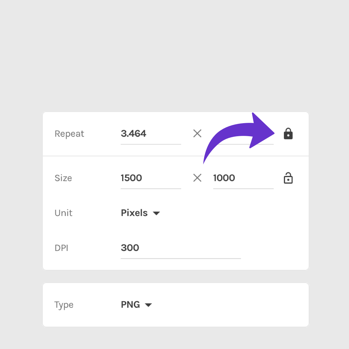
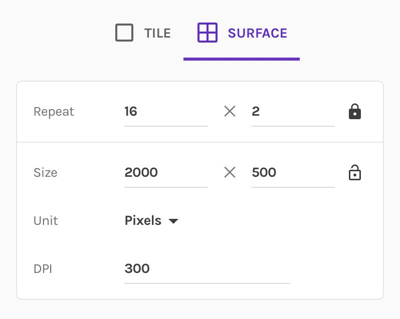
Next time you go into the surface export settings, notice the two little locks. If you'd like to know how it works, read the introduction post about it. Want to know how it can supercharge your metamorphing patterns, read this tutorial.
Enjoy!
That's it for now 👋
Phew, that was a lot to cover. It's a fair few changes, but we think it makes the app more fun and more powerful in use. Give it a go and let us know what you think. We're always keen to hear from you on support@repper.app.
Make beautiful geometric patterns with Repper
Instant results · 14 days free access · No strings attached
Create your own pattern

